|
Exercise
Project on the web
|

|

|

|
Last update 1998.03.31 (1998.03.10 ) [1998.02.26]
|
EXERCISE 3 - YOUR PROJECT ON THE WEB:
From the course description
"The project work shall be documented and made accessible from the World Wide Web. The documentation should be limited to corresponding to 4 A4 pages and contain
- problem description
- solution strategy and findings from the project work
- solution summary
- references."
As soon as you have created something on the web a link is
placed at the 'participants' page.
Aims
This exercise will introduce you to the abilities to document a project digitally and make the information available to the team during the design process and also to store the findings from the project for later use (experience collection).
Prerequisites
It is stated in the course description that the projects of semester 6 - "Good exercise results and results from PE projects will be stored in connection to course pages on the WWW to serve as inspiration material for following years students."
Of course all projects are assumed to serve as good and interesting examples to give inspiration to coming years students. Therefore you are all encouraged to use the web as a means to document part or all of your project work. Some of you will also make use of IT to store project data in the form of databases and/or special tools for visualization. The web documentation of the project gives you an excellent opportunity to document these findings for your own records and for others to benefit from.
How shall I proceed?
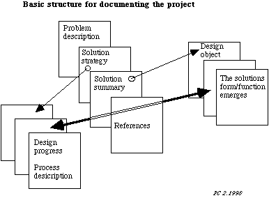
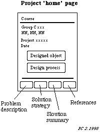
Use the figures below as a template for your project documentation web design. Sketch on a paper the appearance and functionality of the web pages and also how they related to each other.


How shall we start?
- Make sure you have a Word document where you continuously document the project work. Later you will fetch text and images from this document and put them on the web.
- Create the four web pages according to the figure. Use a HTML editor or a any text editor. Download for example DominHTML3.5 from http://sunsite.auc.dk/tucows/adnload/dldfree.html.
- to get inspiration on how to structure pages and image maps look at the course web site structure.
- Also see the download page http://www0.IDG.se/maxidata/share/ where you for example can find a graphic program
Where do we find the HTML specifications?
Make an initial test of your pages
- first test your pages locally in the Netscape browser and then download to
the directory 'public_html' at your server area sv6.civil.auc.dk/~nn. You can for example use vsftp for the file transfer. (You must yourself create the 'public_html' directory),
- ask Finn Ullits Sørensen to create a group consisting of your group particpants. This group should have write access to your common web-pages.
- check that you can use the four clickable links at the bottom of each page,
- the clickable 'icons' may well be only text,
Always remember to take a back-up of the HTML pages and images.
Four important points when you make hypertext;
- Use one style throughout the pages (simple is beautiful)
- Avoid more than 3 level depth on linkages
- Make your pages navigable (avoid people 'getting lost in hyperspace'). The mental image build up should conform with the actual structure.
- Use a clear structure (among other things to support maintenance)
- Document your structure (prefarably in the pages)
Good luck with this initial work documenting your project on the web. Continue to document the project progress in the standard Word document. This is an on-going process during the whole semester 6 course.
Those groups who want to create a group intranet can do so. Contact Per Christiansson for further advice. Also use the 'Discussion Forum' to exchange experiences between groups.
Contact Per Christiansson or Poul Henrik Kirkegaard if you have questions or suggestions..
Follow-up 31.3.1998
- Date when page published and changed. Responsible person.
- Transparent images but not always.
- Structure your work early. Etimate space and navigation demands initially and later.
- External links in separte target windows.
- Navigation palette desig important.
- Use 'TOP links' in long pages (which you really should avoid)
The hypemedia gives some new possibilities in connection with searching, navigating, reading, authoring and feed-back.
Here are some important views on the design of hypermedia documents.
- Allways present the reader with an overview first.
- What is the main content and its structure in the document (more or less explictiely expressed)
- Think about what type of reader(s) (defining 'user models') you expect.
- Meet the readers need for level of interaction, knowledge domain interest and need for output completeness
- Consider receiving feed-back from the readers
- Respect the copyright. Allways ask for permission to use material and state source.
- Structure should be visible explicit or implicit. Document structure and try to navigate it with visitors eyes.
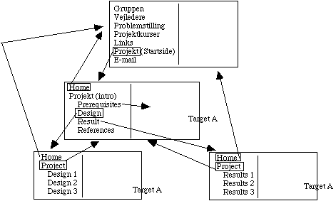
 Principle structure for a FRAME solution.
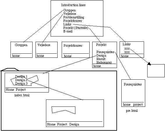
 Principle structure for a NON-FRAME solution.


